Methods

Vulnerability Data

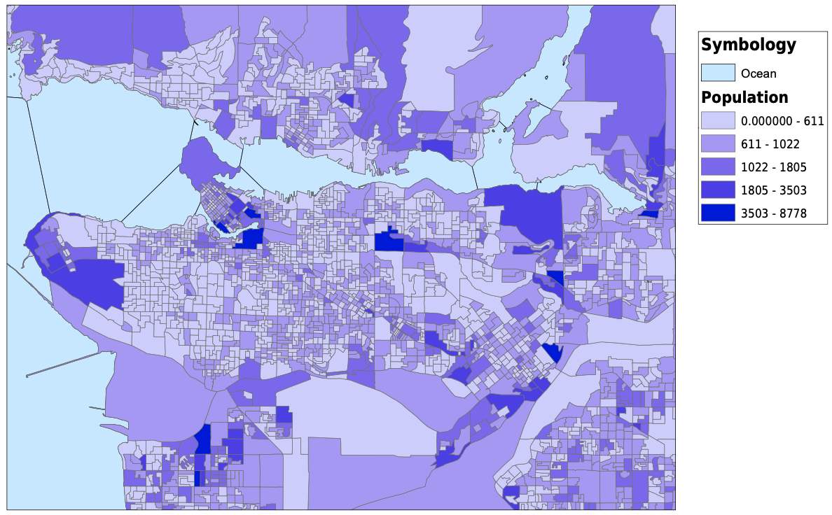
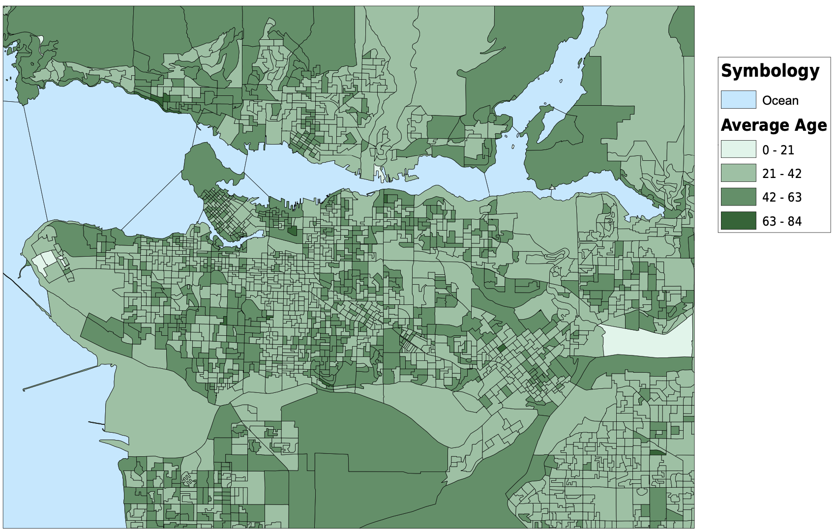
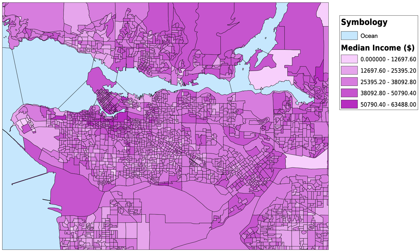
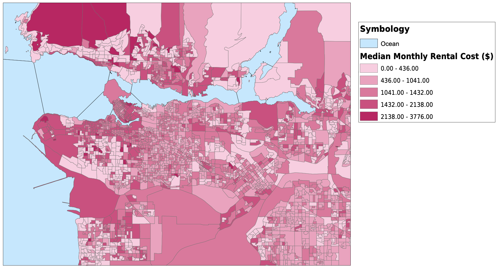
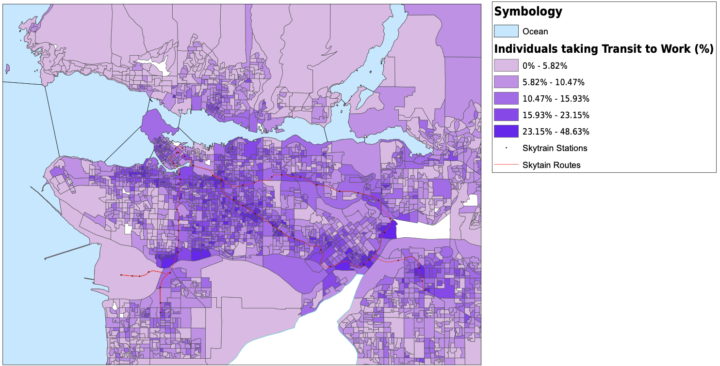
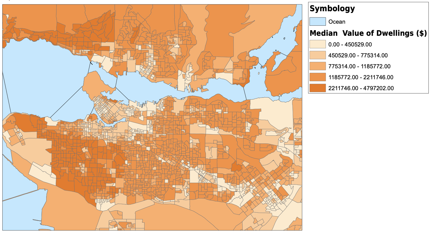
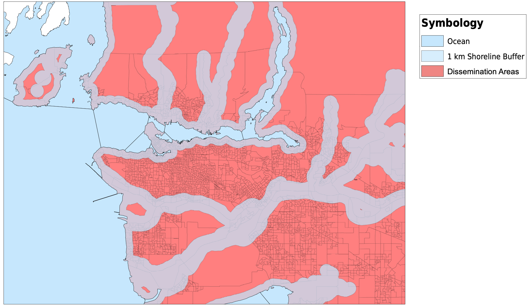
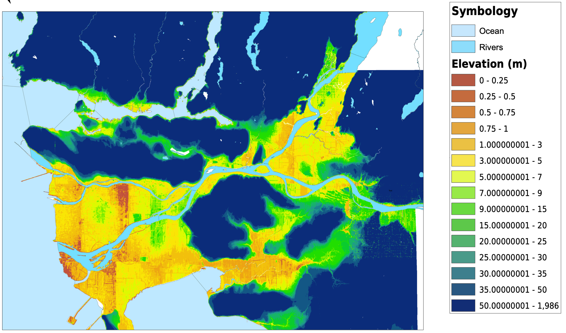
I started my project by downloading dissemination areas from the UBC Library's resource for the Census of Canada, cropped them to the Greater Vancouver Area, and created a new layer for dissemination areas. I altered the data frame's projection to be NAD 1983 UTM Zone 10. The next thing that I did was download tabular data for population, average age, median income, median monthly cost of rent, number of commuters that usually take transit to work, and the median value of dwellings from the University of Toronto’s Computing in the Humanities and Social Sciences website. Once I had all of the tabular data that I needed, I created spatial joins between the dissemination areas and the tabular data, and exported them into new layers. For the transit riders data, I needed to create a new field for transit density, and using the field calculator, divided the transit riders by the total population. After this, I altered the symbology for each layer and had all of my spatial vulnerability data complete and ready to be used. I also downloaded skytrain routes and stations as KML files and converted them into shapefiles. They are plotted with the transit density below. My original plan was to create a vulnerability index that I could compare against elevation or shoreline and have all of the census variables combined into one. In the end I chose not to do this, as it would require me to make too many assumptions and I do not have the knowledge or expertise to make those decisions. For example, in order to create a vulnerability index, I would need to know if a higher age puts you more at risk than a low income. I am not sure how to answer those many questions that were arising so I decided to look at some of the different factors to vulnerability individually. For my analysis, I focused on median income and median monthly rent. I would have loved to analyze the relationship between elevation and every variable that I mentioned above, but it would have been much too timely. Below, you can see all of the variables that I have been looking at, joined to dissemination areas. With a click, the pdf of the map will open.


Map of Population Density
Figure 1: Population in Dissemination Areas in Vancouver
Map of Average Ages
Figure 2: Average Age in Dissemination Areas in Vancouver
Map of Transit Density
Figure 3: Median Income in Dissemination Areas in Vancouver
Map of Median Rental Cost
Figure 4: Median Monthly Rental Cost in Dissemination Areas in Vancouver
Map of Transit Density
Figure 5: Transit Density in Dissemination Areas in Vancouver
Map of Transit Density
Figure 6: Median Dwelling Value in Dissemination Areas in Vancouver

Sea level

Being a city on the ocean, Vancouver must think about its future and the future of the oceans. With climate change comes thermal expansion of water, melting of ice, and with that higher sea levels. While Vancouver is much better off than many cities around the world with regard to sea level rise both in its geography and in its first-world country status, it is important to look at projections and plan ahead.

To show which neighbourhoods and people could be affected by sea level rise, I created a 1 kilometre buffer around the shoreline. This number is rather arbitrary, I wanted to create a map that showed which neighbourhoods are near the ocean and could be at a higher risk of flooding or a change to their life. I do not use the shoreline buffer much in my analysis, rather I just have it to illustrate which areas of the city are near the water. It is possible to see that all of downtown Vancouver, and most of the lower east side is within 1 km of the shoreline. This is concerning as this is where the majority of the homeless shelters are and where most homeless individuals live. It is also the location of a lot of affordable housing options for low-income people and families. You can see this in figure 7, a click will open the PDF.

The bulk of my analysis for sea-level rise was done on the digital elevation model (DEM). Through much trial and error, I was able to convert the DEM to a polygon feature layer. Once this was accomplished, I joined the DEM to a couple of the vulnerability factors and then could perform further analyses. I also reclassified the Digital Elevation model in order to look at Vancouver’s lower elevations, without the entire model. For my reclassifications, I used the same definitions that Emily Nixon defined in her presentation. I used 0.09 m as a best case scenario, 0.88 m as a worst case scenario, and 6 m as a catastrophic scenario. Elsewhere in my analysis I use 5 m as a low elevation value. As the DEM I am using is not extremely specific, I cannot look too much at the best or worst case scenario, and most of my graphs use the low elevation value.

1 km Shoreline Buffer
Figure 7: 1 km Shoreline Buffer
Digital Elevation Model, Clipped to Vancouver
Figure 8: Digital Elevation Model, Clipped to Vancouver

Introduction

Analysis

In order to analyze the potential relationship between elevation and vulnerability, I turned to bivariate choropleth maps and spatial analysis. The results of these methods are in my results section.

Bivariate Choropleth Maps

Bivariate choropleth maps are used to compare two variables or layers that someone thinks might be related. They are created by splitting both variables into a set number of classes, combining those classes and colours that align to those, and putting the result on a map. I created two bivariate choropleth maps comparing both median income, and median rental cost with elevation. In order to do this, I joined the different layers together and classified them into four classes each. For the rent and the income, I used natural breaks for the classification. For the elevation, I manually chose a lower starting point and then used the suggested natural breaks going upwards. My reasoning for this is that once the elevation reaches a certain threshold, it does not matter much what the value is in regards to sea level rise. If a house is located at 150 m above sea level or 300 m above sea level, the risks of sea level rise affecting their property will be similar. I then manually selected attributes that fit into each class, and chose colours for each of the 16 classes based on the colours that I saw in the Center for Disease Control and Prevention’s publication on bivariate choropleth maps. I figure there must be an easier, built-in function for this in ArcGIS but the manual way worked just fine and allowed me to learn more about bivariate choropleth maps.

Ordinary Least Squares & Moran's Index

While the bivariate choropleth map is probably the best way to compare this data, I also performed a couple of other analyses. The first was a global ordinary least squares linear regression. I followed the steps that we used in the third lab this semester. I chose the elevation as the dependent variable, and the median income and median monthly rent as the explanatory variables. I also looked at Moran's index to see if these variables are spatially autocorrelated. I also calculated the correlation matrix and general statistics for the different variables, which can be seen in the results section following.

Geographically Weighted Regression

Geographically weighted regression analyses are a local form of linear regression that can be used to model spatial relationships between variables. As a way to address spatial variation within these layers, this regression model calculates new equations for every feature analyzed. In this case I used the elevation as the dependent variable and the median income and median monthly rent as the explanatory variables.