Results & Discussion

Introduction

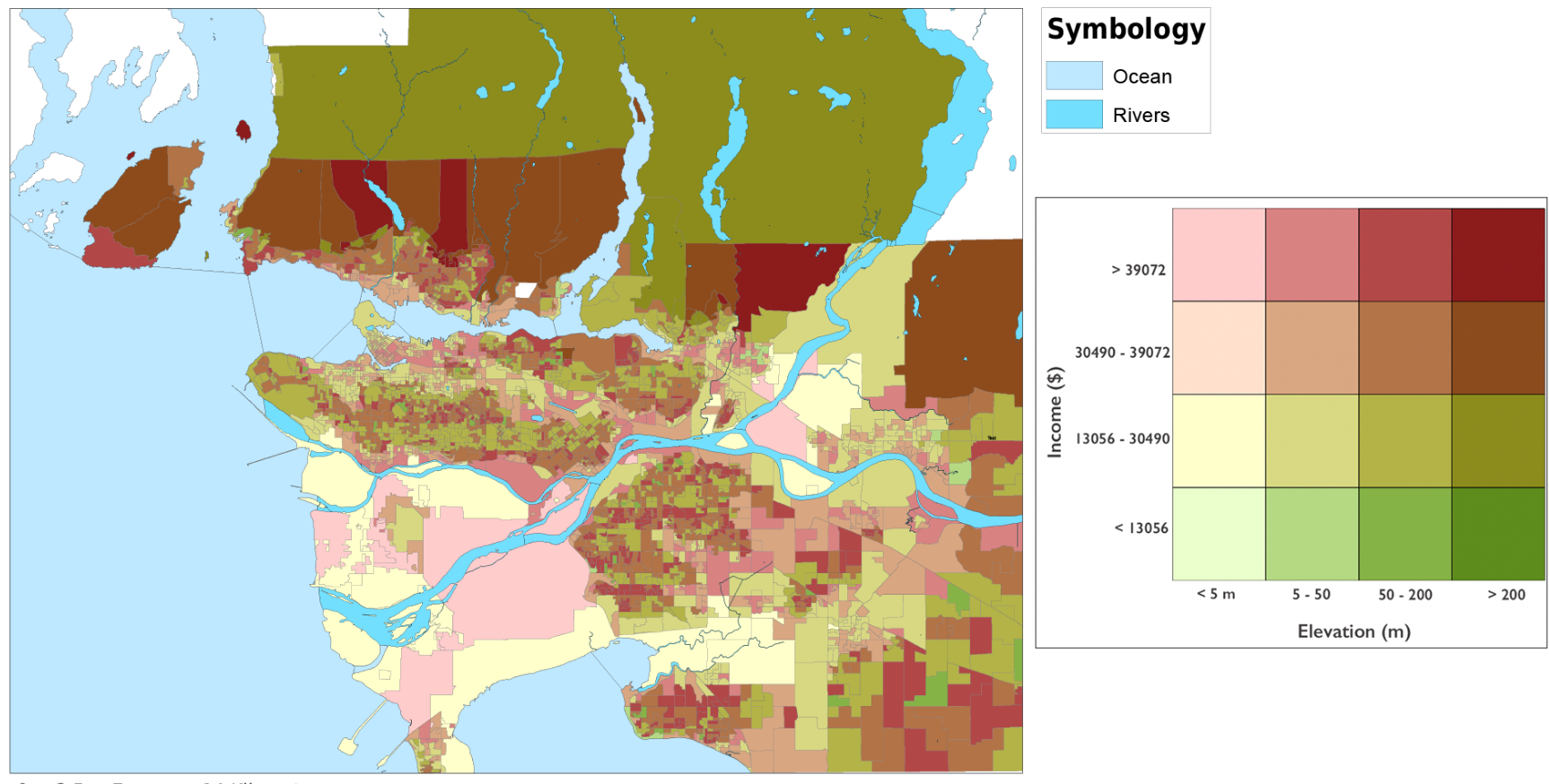
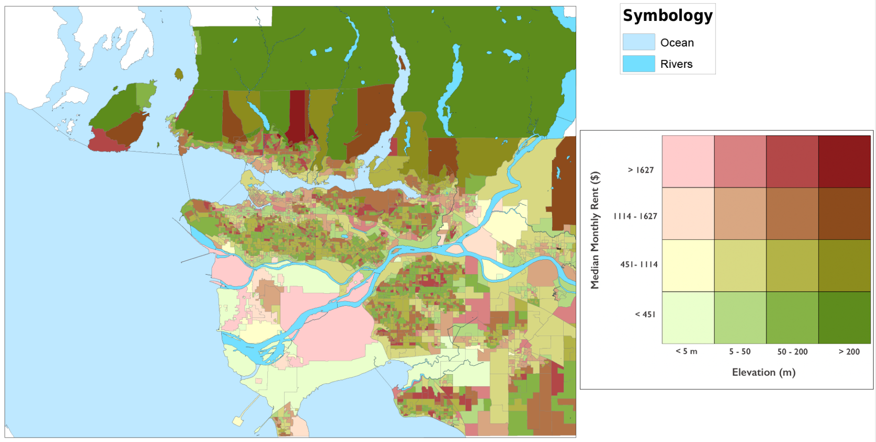
Bivariate Choropleth Map

These maps are the result of my bivariate choropleth analysis. After classifying each variable into four classes, selecting 16 different pairs of attributes for each map, and typing in the correlating RGB colour scheme, I came up with these. The left is median income and elevation, and the right is median monthly rental cost and elevation. At first glance, it looks like there could be some clusters of similar colours. The areas with a low income/monthly rent and a low elevation are coloured pale green and yellow. We can see the palest colour mainly in Richmond, and sprinkled in a few other places around the city. It is also possible to see a low elevation and a slightly higher rent/income in many places around Vancouver. This map shows that there could be a relationship between where we see low elevations, and low income/rent. However, this alone is not conclusive. This pattern could be random and this map could be demonstrating a lack of a relationship between these variables. The bivariate choropleth analysis is not enough on its own to determine a spatial relationship.

Bivariate Choropleth map of Income and Elevation
Figure 1: Bivariate Choropleth map of Income and Elevation
Bivariate Choropleth map of Rent and Elevation
Figure 2: Bivariate Choropleth map of Rent and Elevation

Ordinary Least Squares

This is the map of residuals for the ordinary least square analysis that I performed. In my analysis, the dependent variable is elevation, and the explanatory variables are the median monthly rent and the median income in dissemination areas in Vancouver. At first glance, this map looks like there are clusters of under and over predictions. These, however, are random and the fact that they are clustered means that I have not included all of the variables for this evaluation. I chose one part of the OLS report to speak about, the histogram of standardized residuals. If these features were perfectly normally distributed, the histogram would fit the bell curve. The histogram for the median rent, income, and elevation does not hit the blue line perfectly. This means that these variables are not perfectly normally distributed. Given the shape of the histogram, it is tough to say if they are normally distributed at all. I also calculated Moran’s index as part of the ordinary least squares analysis. Moran’s Index for this analysis is 0.147774 with a z-score of 70.5636 and a p-value of 0.000. With this z-score, there is a less than 1% likelihood that the pattern below is due to random chance. The result of this analysis is that these variables are likely related, but without other key variables, it is not possible to say that conclusively.

Ordinary Least Squares
Figure 3: Ordinary Least Squares Analysis of Elevation, Rent, and Income
Result from Ordinary Least Squares Analysis, Histogram of Standardized Residuals
Figure 4: Histogram of Standardized Residuals

Geographically Weighted Regression

Below is my map for my geographically weighted regression and the outputs that were given when I performed this analysis. I will go over a few of the important values. The residuals squares value is 9832527.34 which is quite large. The smaller this value, the closer this model fits the observed data that I have inputted. Sigma, in this case is equal to 56.74. Smaller values of sigma are sought after in geographically weighted regression analyses. On the map, it appears as if these variables are related, the residuals close to the mean are clustered and it appears there is a pattern. I believe the result of this analysis is similar to the result of the ordinary least squares approach. These variables are likely to be related spatially, but without further analyses with the key variables that are likely missing, it is impossible to say for sure.

Geographically Weighted Regression
Figure 4: Geographically Weighted Regression Analysis of Elevation, Rent, and Income
Results from Geographically Weighted Regression
Figure 5: Results from Geographically Weighted Regression

Correlation

Correlation coefficients range from -1 to +1. A value of -1 means that two variables are perfectly negatively correlated (as one goes up, the other goes down), and a value of +1 means that two values are perfectly positively correlated (they go up together). The two tables I have provided below are the correlation matrices for income and elevation, and for monthly rent and elevation. These were calculated in ArcGIS with the Band Collection Statistics tool. The correlation coefficients for income and monthly rent are -0.583 and -0.332, respectively. The negative number means that these values are negatively correlated. This surprises me, as I have been trying to prove that lower income, lower monthly rent (or other forms of vulnerability) should correlate to a low elevation. I think the result of this tells me that I need to use more variables and factors to carry out an accurate analysis.

Results from Geographically Weighted Regression
Figure 6: Correlation Matrix for Median Income and Elevation
Results from Geographically Weighted Regression
Figure 7: Correlation Matrix for Median Monthly Rent and Elevation

Errors

Accuracy

Throughout my project and the many transformations, spatial joins, projections, reclassifications, etc. that I did on most of the layers, a lot of accuracy was likely lost. Whenever a layer goes through a change in format, accuracy is lost. The digital elevation model, for example, was changed into a raster, a vector, and joined to several of the vulnerability factors from census Canada. Each time something was done to it, it would have lost a bit of accuracy. This can be said for all of the layers that I was using. These losses of accuracy were necessary because I needed to be able to analyze them. The outcome is that this project is not wholly accurate.

MAUP

An error that occurs whenever census tracts or dissemination areas are used is the modifiable areal unit problem. This error occurs because the way that dissemination areas are decided is rather arbitrary. In that, the data that I presented in my project could have been completely different if the dissemination areas all moved by 200m in a certain direction. Different spatial organizations of the data will result in different results. Unfortunately, with the scale of this project, I was unable to mitigate or analyze these errors.

Limitations

My own GIS capabilities, my current level of knowledge, and time constraints worked together to limit my project. If I had more time and more knowledge, I would have loved to create a vulnerability index and compare that with elevations, in order to compare a grouping of all of the factors I was looking at together, at one time.

Introduction

Conclusion

Taken together, the results lead to the conclusion that there may be a relationship between elevation and vulnerability. It is likey that these factors are related. Looking at the median income and the median monthly rent along with the elevation, it looks like there definitely could be a spatial relationship there. I did not analyze enough variables to be certain of that relationship, and did not create a vulnerability index to include all of the factors. Given the background research that is included here, I would say it is extremely likely that there is a relationship between elevation and vulnerability, specifically that there is a higher chance that individuals with a higher social vulnerability index live at a lower elevation, and are thus at a higher risk of being hurt by sea level rise. During any disaster, it is extremely likely that the upper class will end up on top. These issues are magnified today, in a pandemic. Individuals with higher vulnerability are put at the highest risk. Homeless individuals have a much tougher time self-isolating during COVID-19 than individuals who can afford shelter.

Introduction

Further Ideas

In the future I would love to come back to this project. I would like to learn enough about vulnerabilities and how they affect individuals to feel comfortable creating a vulnerability index. In addition, I would like to look at other cities in more depth. I briefly looked at New York, and Miami, when trying to compare Vancouver to other cities, and I think it would be very interesting to look at similar issues affecting other cities, with higher populations and at an increased risk to sea-level rise.